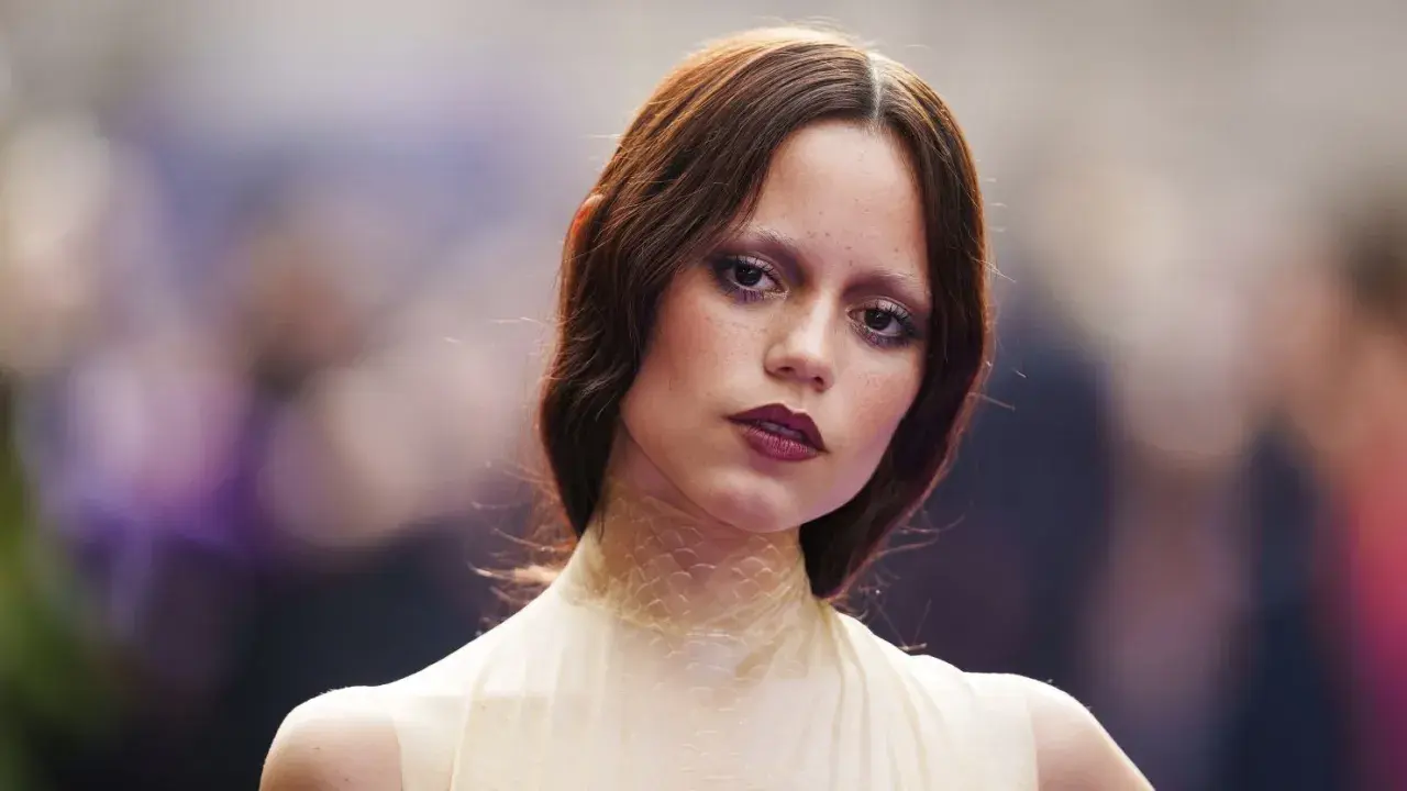
There is a reason tired girl makeup has stayed visible well beyond a single viral cycle: it gives the face mood, softness, and attitude without needing a perfectly polished finish. The goal is not to look exhausted in a literal sense; it is to mimic blurred edges, muted shadow, and slightly flushed skin so the result feels relaxed, lived-in, and a little cinematic. I’m going to break down what the look is, how it differs from cleaner beauty trends, and how to make it work on real skin without crossing into “I forgot my makeup” territory.
The look should feel deliberate, not unwell
- Keep the base light. The finish should still look like skin, not a mask.
- Use muted colour near the eyes. Soft rose, brown, plum, and brick tones create the right sense of fatigue without going harsh.
- Blur the edges. Smudged liner and diffused shadow matter more than precision.
- Let the lips look worn in. A stain or softly tapped balm sells the mood better than a crisp lip line.
- Balance the face. If the eyes are moody, keep the brows and skin controlled so the whole look still feels intentional.
What this look is really doing
The appeal of this style is that it borrows from exhaustion without actually trying to mimic poor sleep in a literal way. In practice, it is a controlled blur: a little darkness under the eyes, a little flush around the cheeks, and enough softness around the lashes and mouth to make the face read as unguarded. That is what makes it interesting. It sits somewhere between beauty and atmosphere, which is why it can feel romantic on one person and slightly subversive on another.
I also think it has staying power because it pushes back against the hyper-polished face that has dominated so much beauty content. It leaves room for texture, asymmetry, and a bit of mess. For queer readers especially, that can be useful: it gives you permission to look expressive rather than perfect, and expressive often reads as more honest, more modern, and more fun.
By 2026, the trend has become less literal and more wearable. The strongest versions no longer copy actual under-eye fatigue pixel for pixel; they borrow the softness, the mood, and the slightly off-centre energy. Once that idea makes sense, the next question is how it sits beside the other beauty moods around it.
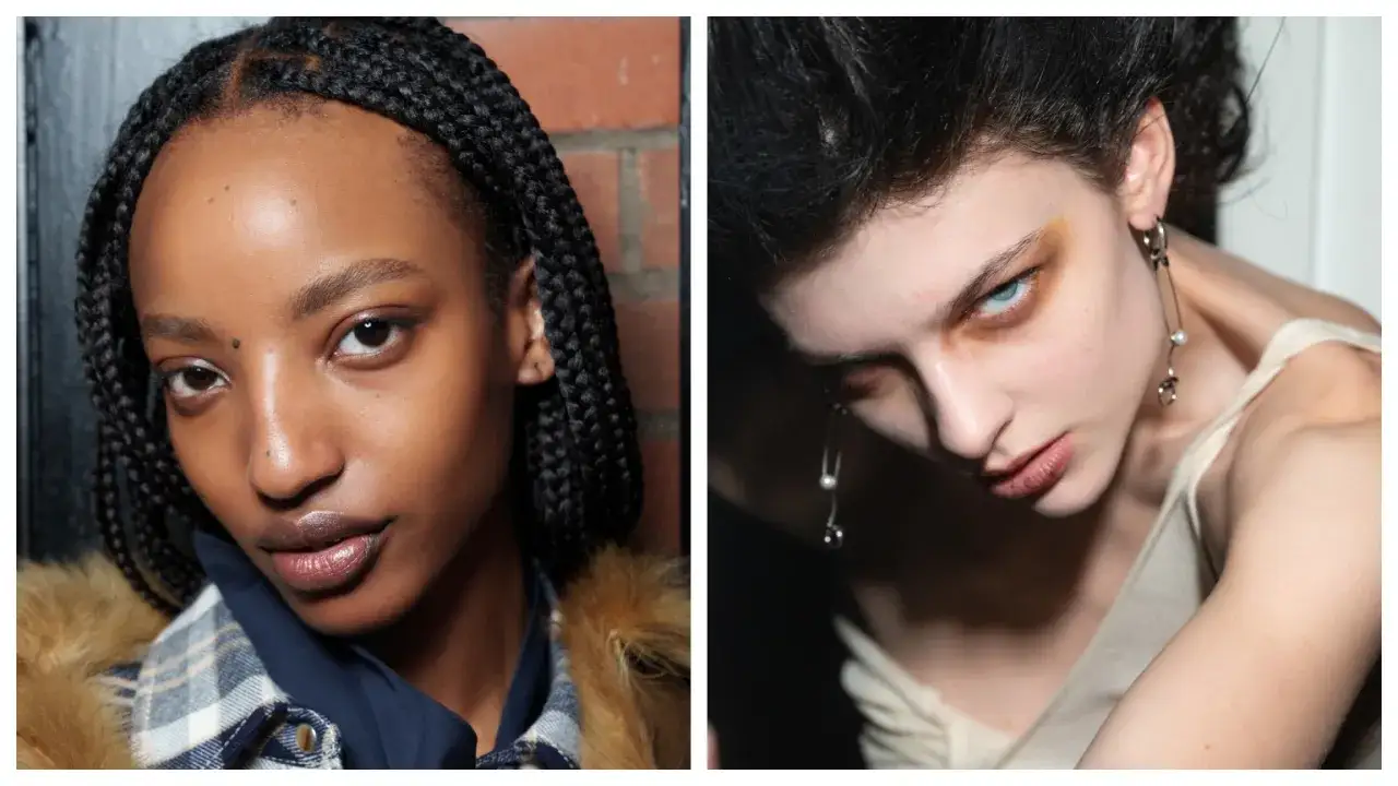
How it differs from cleaner, softer and grungier makeup
People often lump this look in with clean-girl minimalism or with full grunge, but those are not the same thing. The difference matters, because the placement and texture choices change depending on which direction you want. If you know the family resemblance, it becomes much easier to decide how far to push it.
| Look | Main effect | Texture | Where it works best |
|---|---|---|---|
| Clean girl | Fresh, polished, controlled | Satin to dewy | Office days, minimal makeup, daytime wear |
| Sleepy-soft version | Gentle flush, softened eyes, relaxed face | Creamy and blurred | Everyday wear, softer trend interpretation |
| Undone moody look | Shadow, fatigue, lived-in edges | Smudged and slightly matte | Evenings, editorial moments, creative beauty |
| Grunge | Dark, heavier, more dramatic | Matte or smoky | Concerts, fashion-forward looks, Halloween |
The useful distinction is this: the softer version gives you the mood without much contrast, while the moodier version leans into shape and shadow. If you want the look to read as current rather than costume-like, keep at least one element clean enough to anchor the face. That usually means the brows, the skin, or the lip edge, not all three at once. With that contrast in mind, the trick is building the base so it still looks like skin.
Build the base so skin still looks like skin
This is where most people go wrong. They either cover too much and lose the texture that gives the look its charm, or they pile on product until the face starts looking tired for the wrong reasons. I prefer a base that is breathable and selective: moisturise first, use light coverage where you need it, and leave some natural variation visible.
A realistic UK shopping budget helps here. If you already own mascara and a brow product, you can build a solid version of the look for roughly £20 to £60 with budget staples. A more refined mid-range kit usually lands around £45 to £90, depending on whether you buy a skin tint, a cream blush, and a soft eye product separately.
| Item | Approx. UK price | Why I’d use it |
|---|---|---|
| Light base or skin tint | £6-£35 | Keeps texture visible instead of flattening the face |
| Spot concealer | £4-£25 | Lets you correct redness without masking everything |
| Cream blush | £4-£30 | Creates the soft flush that makes the face feel alive |
| Brown pencil or cream shadow | £3-£22 | Adds believable shadow without the harshness of black |
| Blurred lip tint or balm | £4-£35 | Finishes the look with a soft, worn-in mouth |
- Prep with moisture, not grease. Give the skin a few minutes to settle so the makeup can melt in rather than slide off.
- Apply coverage only where it matters. Around the nose, on blemishes, and perhaps the centre of the face is usually enough.
- Keep the under-eye light. If your dark circles are naturally deep, soften them; do not try to counterfeit more darkness than you already have.
- Leave some sheen. A completely matte base can make the whole effect feel flat and older than it should.
Once the base is behaving, the eyes, cheeks, and lips do the real storytelling.
Eyes, cheeks and lips that carry the mood
This is the part that turns a soft face into a recognisable trend. The details matter more than the amount of product. I usually think in terms of blur, placement, and tonal harmony rather than any one hero item.
- Eyes. Use soft brown, plum, or grey-brown shadow close to the lash line, then smudge it upward with a finger or small brush. The shape should look slightly slept-in, not sharply designed.
- Liner. A pencil liner blended at the edges works better than a hard liquid wing. If you want extra attitude, extend it just a little at the outer corner and soften the tail immediately.
- Lashes. Keep mascara concentrated at the roots and outer lashes. A slightly separated, imperfect lash line usually reads more convincing than heavy, clumped volume.
- Cheeks. Place blush lower and closer to the centre of the face than you would in a lifted “fresh-faced” look. Rose, berry, muted brick, and soft mauve are the most useful tones.
- Lips. A tinted balm, blurred stain, or lipstick tapped on with a finger feels more on-theme than a crisp outlined lip. Think “worn in” rather than “done”.
If you want the mood to lean slightly more editorial, deepen the eye socket with a little brown-grey shadow. If you want it to feel more wearable, let the cheeks do the work and keep the eyes softer. That balance is what keeps the face expressive instead of theatrical. The next step is matching the intensity to the person wearing it and the place they are going.
How to adapt it for your face and day
There is no single formula that works on everyone. Skin tone, texture, eye shape, and setting all change the result. The best version is the one that looks like a deliberate choice on your face, not a trend pasted on top of it.
Match the tones to your complexion
On fair skin, taupe, rose-brown, and muted mauve usually look softer than flat grey, which can go chalky fast. On medium and olive skin, cinnamon, cocoa, rust, and brick bring warmth without making the face look ruddy. On deeper skin, espresso, aubergine, wine, and rich berry tones usually read better than pale, ashy neutrals because they keep the depth intentional.
Choose textures that suit your skin type
If your skin is dry or textured, creams and balms are your friends. They melt together and keep the look alive. If your skin is oilier, use powder only where it earns its place, especially around the T-zone, and set the centre of the face lightly so the blur does not disappear by lunchtime. For mature skin, I would keep the lower lash line especially soft, because hard matte lines tend to settle into texture more quickly.
Read Also: Gay Men's Fashion: 2026 Trends & UK Style Guide
Adjust it for the setting
For daytime or work, reduce the red-pink under-eye effect and keep the blush more neutral. For an evening out, a stronger lash line and a deeper lip stain can make the look feel polished enough for low light. For creative events, nightlife, or performance spaces, you can push the shadow further and make the lower lash line more visible. The point is not to look ill; the point is to look intentionally undone. That is where the main risks show up, so the common mistakes are worth calling out directly.
The mistakes that make it look accidental
- Over-darkening the under-eye area. Too much brown, plum, or grey can move the face from styled to genuinely tired. Keep the colour translucent and feathered.
- Using full-coverage matte base everywhere. That erases the lived-in quality. If you need coverage, place it strategically rather than over the entire face.
- Drawing black liner too sharply. A hard line fights the softness of the trend. Smudge the edge before it sets, or use pencil instead.
- Choosing a lip colour that is too orange or too bright. The mouth should look stained or blurred, not like a separate statement.
- Ignoring the brows. Brows that are too perfect can make the rest of the face look disconnected. A little softness or natural texture helps the whole look hold together.
- Trying to make every feature look tired at once. One or two cues are enough. If the eyes are smoky, keep the cheeks and lips restrained.
Those mistakes are easy to fix once you see them, and the fix usually comes down to reducing contrast rather than adding more product. The final step is knowing what version I would actually wear outside a trend cycle.
The version that holds up in real life
If I were building this for real life in 2026, I would keep one feature dominant and let the others support it. Most days that means a soft eye, a gentle flush, and a mouth that looks stained rather than painted. If I wanted the look to feel sharper, I would deepen the shadow just enough to create structure, but I would stop before it became theatrical. That restraint is what makes the style feel current rather than dated.
My rule of thumb is simple: soft skin, blurred edges, one clear intention. That combination works whether you are going for a low-key daytime version, a night-out edit, or a more creative look with a queer, fashion-forward edge. The trend is strongest when it feels expressive instead of performative, and that is why it keeps resurfacing in different forms. If you keep the base breathable and the eye shape slightly undone, you will get the mood without losing the person wearing it.
In practice, the easiest starting point is a sheer base, a rose-brown cream blush, a smudged brown pencil, and a softly tapped lip stain. That is enough to create the atmosphere without overcomplicating the face, and it gives you room to adjust the intensity depending on where you are going.