What matters most right now
- Florals are still here, but the update is softer, more nostalgic, and less obvious.
- Polka dots have gone smaller and smarter, which makes them easier to wear in everyday outfits.
- Plaid and stripes feel sharper when they look tailored instead of overly retro.
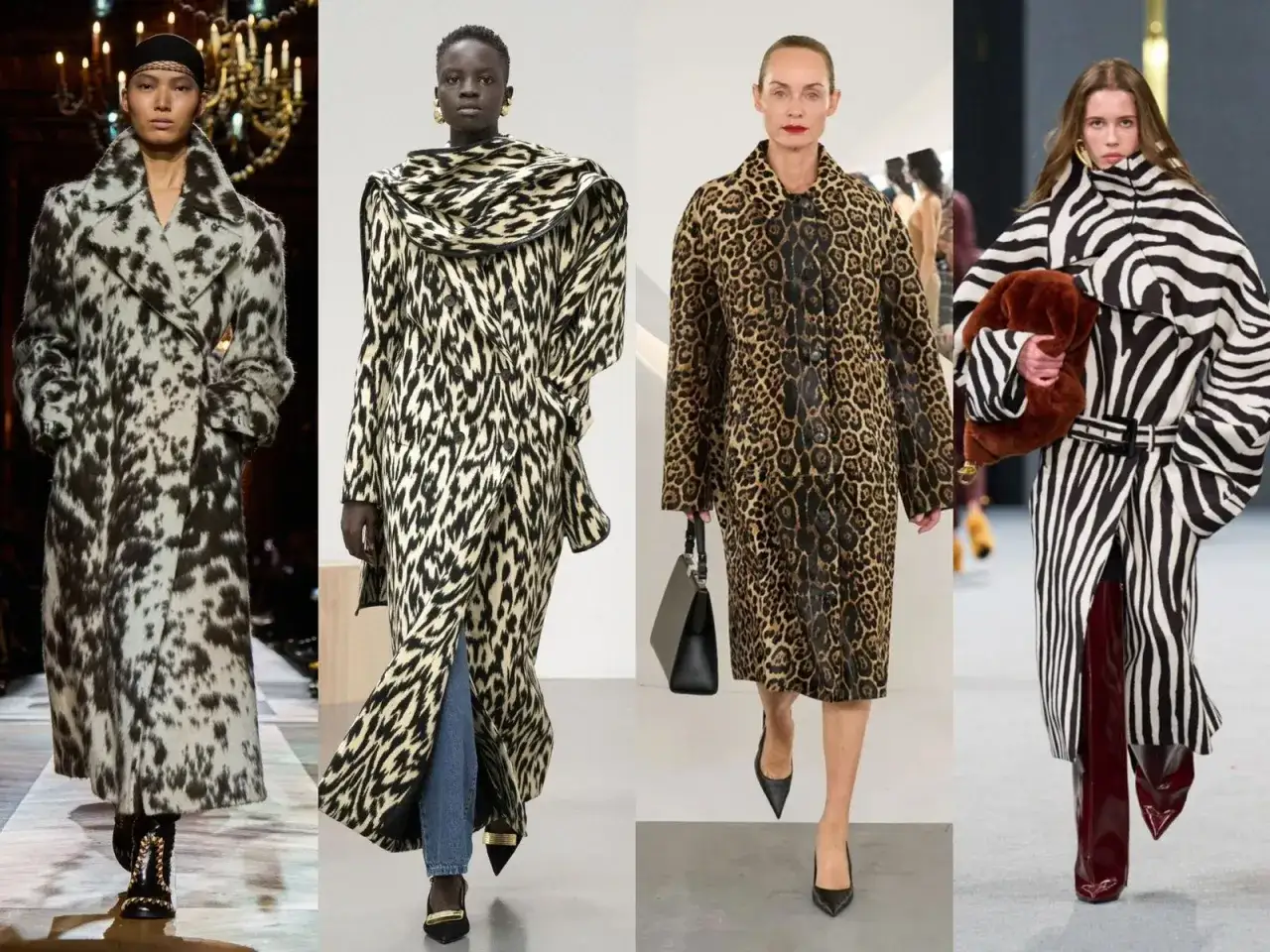
- Animal print has broadened into zebra, tiger, and abstract versions that feel fresher than standard leopard.
- The easiest way to wear pattern is to keep the rest of the outfit quiet and repeat one colour from the print.
The print families shaping 2026 wardrobes
I would start with the motifs that are doing the most work across runways and high street collections. These are not gimmicks; they are the pattern families that can carry a whole outfit, which is why they matter more than a passing novelty print.
| Pattern family | Why it feels current | Best place to wear it | How I’d style it |
|---|---|---|---|
| Soft florals | More romantic and slightly nostalgic, with a lighter, less formal mood | Dresses, blouses, skirts, silk scarves | Balance the sweetness with tailoring, denim, or a clean shoe |
| Small polka dots | Scaled-down dots read more polished than playful | Shirt dresses, midi skirts, light knitwear | Stick to two-tone palettes first, then add colour once the silhouette works |
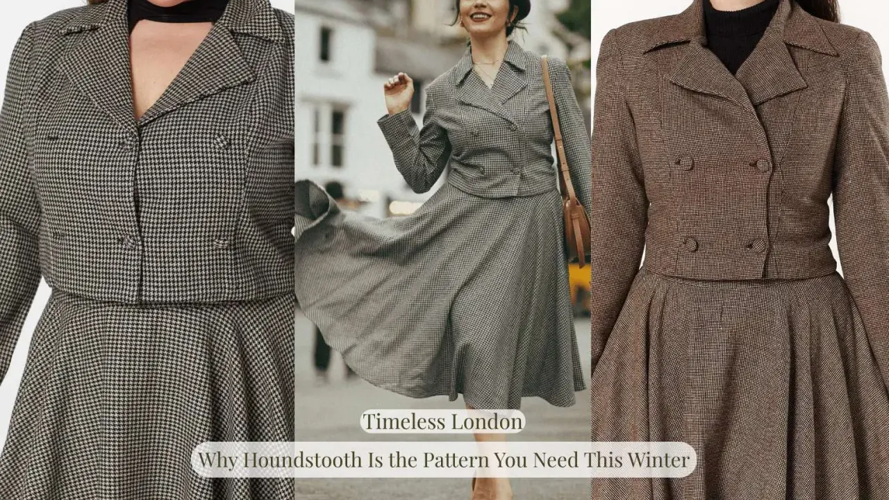
| Refined plaid and tartan | Grown-up checks feel more structured than grunge-inspired versions | Blazers, coats, trousers, structured skirts | Let the cut stay clean so the print does not feel heavy |
| Cabana stripes | They bring a crisp, breezy energy without needing a full holiday wardrobe | Shirts, knit polos, dresses, wide-leg trousers | Use navy, white, cream, or sand as the base to keep them sharp |
| Updated animal print | Zebra, tiger, and abstract takes feel fresher than the usual leopard formula | Outerwear, skirts, tops, bags | Keep the garment shape simple and let the motif do the talking |
| Blurred or digital motifs | Soft distortion makes a familiar pattern feel more modern and artistic | Statement dresses, evening pieces, scarves | Best when the rest of the outfit stays calm and unfussy |
That is the broad map, but the real difference comes from scale, fabric, and how much visual energy you actually want to carry. Once those basics are clear, choosing a pattern becomes a styling decision instead of a gamble.
How to choose a pattern that works with your clothes
I usually begin with the wardrobe that already exists. If your week is built around denim, tailoring, knitwear, and trainers, a print has to earn its place beside those pieces. A strong motif should make your current clothes feel more interesting, not force you to build an entirely new style around it.
- Start with scale. Large motifs read louder; small motifs are easier to repeat and easier to wear often.
- Match the contrast to your palette. If you live in black, navy, cream, and denim, a two-tone print will usually do more for you than a high-saturation mix.
- Let the fabric do some of the work. Soft florals often look better in viscose or silk, while plaid and checks feel stronger in twill, wool, or denim.
- Keep the colour count under control. Two or three colours are usually enough if you want the item to work with more than one outfit.
- Test the print against your real shoes and outerwear. If it only works with one specific bag or one special pair of heels, it is probably too fragile for everyday life.
My rule is simple: if a pattern can sit comfortably beside your usual basics, it will work far harder than a trend piece that only looks good on its own. With that filter in place, the next question is where the print should actually go.
How to wear prints for work, weekends, and nights out
In the UK, the smartest way to wear pattern is to let the setting decide the volume. A print can be quiet enough for the office, relaxed enough for weekends, or deliberately loud for a night out, but it should not fight the tone of the moment.Work and smarter days
For work, I like one patterned piece and one clean layer. A checked blazer over a plain tee, a striped shirt under a trench, or a small-dot blouse with tailored trousers all feel current without turning into a costume. In a city wardrobe, that balance matters because you need the outfit to survive meetings, commuting, and whatever weather the day throws at you.
Weekends and casual days
Weekends are where you can relax the formula. A printed shirt with jeans, a patterned midi skirt with trainers, or a floral knit with a simple coat can look polished without trying too hard. The trick is not to build the whole outfit around the print; let it sit inside a normal outfit so it feels lived-in rather than styled for a photograph.
Evening and events
This is where bolder motifs earn their keep. A blurred floral dress, a sharp animal-print top, or a striped satin piece feels more intentional when the fabric has some sheen or weight. If the print is dramatic, keep the silhouette clean and let accessories stay minimal. That restraint is what makes the look feel grown-up.
Read Also: Seasonal Colour Analysis - Find Your Perfect Palette
Pride and festival dressing
This is the easiest setting for pattern to become expressive rather than merely decorative. Oversized motifs, strong colour blocking, and mixed-scale prints can feel joyful, especially when the rest of the outfit is grounded with one plain shoe or bag. For a lot of queer wardrobes, this is also where clothing stops being about fitting in and starts becoming a way to show up with clarity.
Once you know how the outfit will be worn, the next thing to watch is whether the pattern looks deliberate or simply busy. That difference is more important than most people think.
What makes a pattern look expensive rather than busy
A good print can still look wrong if the shape, fabric, or styling is off. The pattern itself is only part of the equation; the garment needs enough structure to hold the eye without turning chaotic.
- Too many focal points. If the print, embellishment, and silhouette are all shouting, the outfit loses clarity.
- The wrong fabric. A strong motif on a flimsy fabric can look cheap quickly, even if the print is good.
- Ignoring silhouette. A loud pattern works better when the shape is simple and the fit is considered.
- Clashing without a plan. Print mixing works best when the pieces share a colour, scale, or mood.
- Buying novelty first. A one-off pattern is fun; a repeatable pattern is valuable.
The best test I know is this: if you remove the print, would the garment still look well made? If the answer is no, the pattern is doing too much of the work. That is where style turns from smart to messy.
Why prints are a useful tool for self-expression
Pattern matters because it changes how an outfit is read. A plaid jacket can feel precise and androgynous, a floral blouse can soften tailoring without making it precious, and a bold stripe can add energy without making the rest of the outfit harder to wear. That flexibility is useful if you do not want your clothes to sit neatly inside one expected code.
I like prints for that reason: they let you be specific without being predictable. They can make a look feel more feminine, more masculine, more playful, or more neutral, depending on how you style them. The point is not to dress for a category. It is to choose the version of yourself you want people to see first.
The simplest way to build around patterns without overbuying
If you want a practical way to stay current, build the wardrobe in threes: one hero print, one calm base item, and one bridge piece that ties them together. That gives you flexibility without filling your closet with clothes that only work in one narrow mood.
- Choose one statement piece first. A shirt, skirt, or jacket is usually easier to rewear than a full head-to-toe look.
- Make sure it works with at least two existing outfits. If it does not, it is probably too specific.
- Leave one part of the outfit quiet. A plain shoe, a clean coat, or a solid bag usually makes the print look better.
If you keep the palette tight, the fit honest, and the silhouette realistic for your day-to-day life, you will get far more wear out of pattern-led pieces. That is the real advantage of the strongest trending patterns in 2026: they make style feel more personal, not more complicated.