Monochrome outfits can look sharper than mixed-colour looks because the eye reads one continuous line. The trick is that “one colour” does not mean “one flat tone”; the best versions mix texture, weight and shade so the result feels deliberate rather than stiff. I’ll break down what the style actually is, how to adapt it to British dress codes, and where people usually go wrong when they try it for the first time.
That matters whether you want something office-ready, a cleaner night-out look, or a more androgynous silhouette that lets the clothes speak before the colour does. With the right palette, this is one of the easiest ways to look composed without spending ages assembling the outfit.
The main things to know before you build a one-colour look
- Monochrome is about a single colour family, usually with a few tonal shifts, not identical pieces from top to bottom.
- Texture matters as much as colour; knitwear, denim, wool, satin and leather keep the outfit from looking flat.
- Darker palettes read more formal, while lighter neutrals and soft colours feel easier for daytime and warmer months.
- For British dress codes, monochrome works best when the silhouette matches the setting: sharp tailoring for work, softer fabrics for weddings, cleaner lines for smart-casual.
- Accessories should support the palette, not fight it; the shoe and bag choice usually decide whether the look feels polished or unfinished.
What monochrome dressing actually means
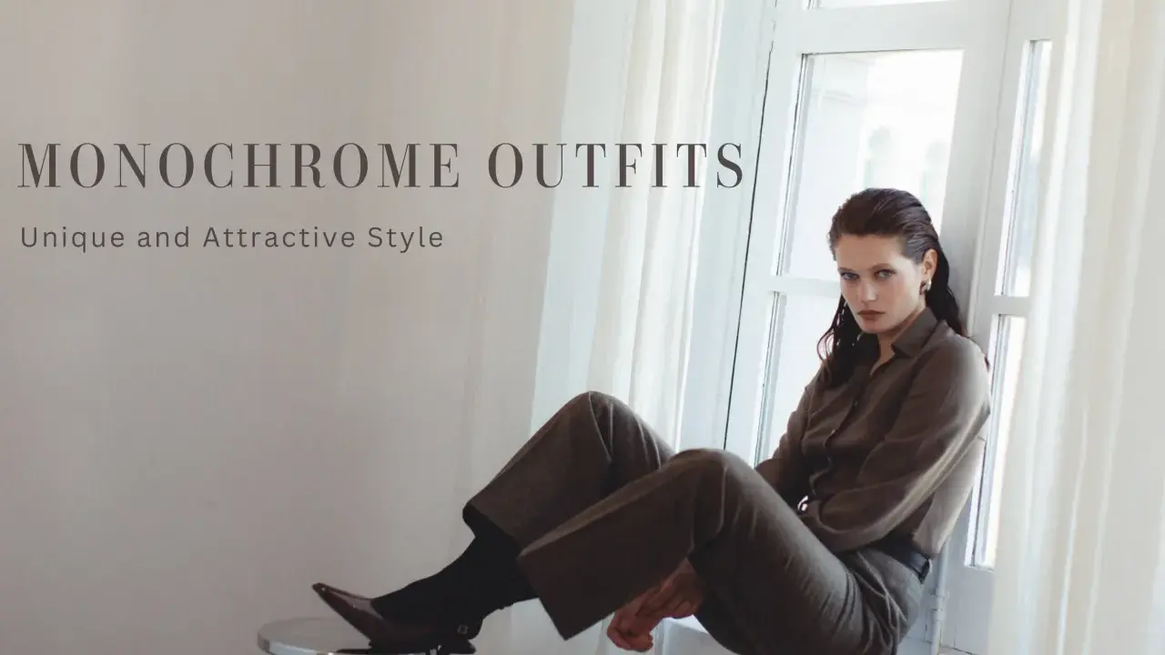
At its simplest, monochrome means dressing in one colour family from head to toe. In practice, I rarely recommend matching every piece exactly; a charcoal coat, mid-grey trouser and pale grey knit usually look better than three identical greys because the tonal changes give the eye something to follow.
This is why all-black and all-white outfits are only two versions of the same idea. A true monochrome palette can be navy, burgundy, olive, camel or even cobalt, as long as the pieces stay inside the same colour story. That flexibility matters, because it lets you adapt the look to weather, dress code and personal style instead of forcing yourself into one rigid formula.
The useful distinction is between matching and layering. Matching can work for a suit or a sleek evening set; layering is better for everyday clothes, where texture and shade need to do more of the work. That difference becomes important once you start deciding why the style looks so strong in the first place.
Why one colour feels polished instead of plain
The main reason one-colour dressing works is that it reduces visual interruption. When the colours stop competing, the shape of the jacket, the drape of the trouser and the line of the shoe become more obvious, which is exactly why this approach often looks expensive even when the clothes themselves are simple.
I also find it useful for people who want their clothes to feel less gendered without becoming costume-like. A clean monochrome palette can make tailoring, softness or androgyny read clearly, because the silhouette is doing the talking instead of a loud print or a pile of decorative detail.
- It elongates the body visually. One continuous colour line tends to make the outfit look longer and leaner.
- It simplifies decision-making. You spend less time matching separate colours and more time improving fit.
- It makes texture feel intentional. Satin next to wool or denim next to cashmere reads as design, not accident.
Once you know why the approach works, the next step is learning how to build it without ending up flat or over-styled.
How I build a one-colour outfit that still has depth
I start with a base piece that suits the occasion, then add contrast through texture rather than more colour. For example, a wool trouser with a ribbed knit and a smooth leather shoe creates more interest than three items in the same fabric, even if they are all black.
- Pick the shade first. Decide whether the look should feel sharp, soft, warm or cool. Navy and charcoal usually read more formal; cream, stone and powder tones feel lighter.
- Choose one dominant texture. Let one material lead, such as denim, tailoring, silk or knitwear.
- Mix one supporting texture. Add a second material with a different finish so the outfit has depth.
- Repeat the colour in the accessories. Shoes, belt, bag or jewellery should sit within the same family or stay neutral enough not to break the line.
- Check the proportions. If everything is slim, the look can feel severe; if everything is oversized, it can lose shape.
That formula is simple, but it becomes much more useful when you apply it to actual dress codes rather than imagining the look in the abstract. This is where the British context makes a difference.

Monochrome ideas for British dress codes and everyday plans
In the UK, the weather, the commute and the setting often shape the outfit as much as the event itself. A monochrome approach can work in all of those situations, but the fabric and silhouette need to match the level of formality.
| Dress code | Monochrome direction | Why it works | What to avoid |
|---|---|---|---|
| Smart-casual | Grey knit, charcoal trousers, clean trainers or loafers | Looks relaxed but still intentional | Too many shiny finishes or overly sporty pieces |
| Office or business-casual | Navy blazer, navy trouser, tonal shirt, dark shoe | Feels authoritative without being severe | Clashing blues or wrinkled fabrics that break the line |
| Wedding guest | Sage, burgundy, soft blue or champagne in silk, crepe or wool | Reads elegant in photos and less predictable than a print | Stark white unless the dress code explicitly allows it |
| Cocktail or evening | All-black, deep chocolate, midnight blue or rich red with one strong texture | Feels polished and slightly dramatic | Over-accessorising with too many metallic accents |
| Creative or fashion-led event | One bold colour, such as cobalt or emerald, with an interesting cut | Makes the outfit memorable without looking busy | Using the same colour in pieces that all have the same weight and finish |
The biggest mistake here is treating outerwear as an afterthought. In British weather, the coat is part of the outfit for much of the year, so if it breaks the palette the whole look feels less complete. That is why colour choice matters almost as much as fabric choice.
The colours I reach for most often in the UK
British weather rewards palettes that can move between indoor light, rain and late-afternoon gloom without looking washed out. For me, the safest starting points are navy, charcoal, black, cream and chocolate, because they behave well in office settings and still feel deliberate when the outfit needs to go straight to dinner.
- Black works best when you want sharpness, contrast and evening energy.
- Navy is easier than black for daytime because it looks softer and less severe.
- Charcoal and grey are ideal for tailoring, especially when you want a look that feels understated rather than corporate.
- Cream, ivory and stone feel cleaner and more relaxed, but they rely on good fabric quality because cheap materials show up quickly.
- Chocolate, olive and burgundy give winter monochrome more warmth and texture.
- Cobalt, red and emerald are best when you want the outfit to feel confident and a little theatrical.
I like colour families that can carry through outerwear as well as the core outfit. If the coat lives in the same range, the whole look feels considered instead of half-finished, and that matters even more once you start spotting the common mistakes.
The mistakes that make the look feel flat
The first problem is assuming monochrome means sameness. If the colour, fabric and silhouette all repeat with no variation, the result can feel accidental or stagey rather than elegant.
- Using the same finish everywhere. A matte knit, a crisp cotton shirt and a polished shoe will almost always beat three pieces that all look equally flat or equally shiny.
- Ignoring fit. Monochrome exposes shape problems quickly, so a slightly off trouser length or shoulder line stands out more than it would in a busier outfit.
- Forcing exact matches. A near-match usually looks better than a desperate match. Slight tonal variation feels sophisticated, especially in daylight.
- Choosing the wrong shoes. Footwear can break the line of the outfit instantly; if the shoes clash, the whole look stops feeling monochrome.
- Adding too many accents. Once belts, bags, jewellery and layers all compete, the point of the palette gets lost.
When people say this style feels easy, they usually mean the colour choice is easy, not the styling. The final polish comes from personal details, which is where the look stops being formulaic.
How to make it feel personal rather than uniform
This is the part I care about most, because a monochrome look can either reveal personality or flatten it. The easiest way to keep it expressive is to decide what story the outfit should tell: relaxed, sharp, sensual, minimal, romantic or androgynous.
In queer and gender-expansive style especially, a single-colour palette can be useful because it removes some of the visual coding that people often attach to gender. I often see it work when the wearer wants clean lines and confidence without relying on a heavily feminine print or a traditionally masculine suit formula.
- Change the silhouette. Try wide-leg trousers, a cropped jacket, an oversized shirt or a fitted knit to shift the mood.
- Let accessories do one job. A chunky ring, sharp loafer, structured bag or statement earring can signal personality without breaking the palette.
- Use one focal point. If the colour is quiet, let the neckline, hemline or shoe shape carry the attitude.
- Think about finish. Matte reads calm, satin reads dressed up, leather reads tougher, and knitwear reads softer.
Once those details are in place, the style stops being a rule and starts becoming a usable wardrobe language. The last thing worth doing is refining that language so it still feels current next year, not just today.
The details that keep a one-colour wardrobe current
In 2026, the cleanest looks are still the ones that feel lived-in rather than over-designed. I would keep using three rules: build around texture, let the outer layer stay in the same family, and choose one slightly unexpected detail such as a belt shape, a pointed shoe or a sharper sleeve line.
- Do not chase perfect matching. Slight variation makes the outfit look more expensive and less costume-like.
- Let the season change the fabric. Linen and cotton make light palettes feel believable in warmer months; wool, leather and heavier knits do the same in colder weather.
- Keep one element practical. A clean trainer, a flat loafer or a structured bag often grounds the look for everyday wear.
If I were building a wardrobe around this idea from scratch, I would start with one dark palette, one light palette and one colour that feels bold enough for evenings. That gives enough range to handle work, weekends and events without turning the style into a costume.