The palette works best when warmth stays soft and contrast stays low
- Choose mid-toned, earthy shades over vivid brights or chalky pastels.
- Replace harsh black-and-white contrast with camel, espresso, warm grey and ivory.
- Build outfits around one neutral, one muted colour and one subtle accent.
- Use texture to add depth: suede, brushed wool, denim and matte knits do most of the work.
- If you sit between seasons, compare warm muted shades with cooler dusty ones in daylight.
What soft autumn actually means in practice
I usually describe this season as autumn with the intensity turned down. The colouring is warm-neutral, low to medium contrast and visibly blended rather than sharp, so the best shades sit in the middle of the value range instead of shouting from either extreme.
Compared with Soft Summer, the palette is warmer and more golden. Compared with True Autumn, it is gentler and less saturated. That difference matters because two people can both look good in earthy colours while needing very different versions of them; one needs more greyness, the other needs more warmth.
| Trait | What it looks like | What it means for clothes |
|---|---|---|
| Undertone | Warm-neutral rather than icy-cool | Choose colours with a little yellow, beige or gold in them |
| Contrast | Low to medium | Keep outfits softly layered instead of graphic and harsh |
| Value | Mostly mid-tones | Avoid extremes like optic white or jet black near the face |
| Finish | Muted, earthy, slightly dusty | Matte and softly textured fabrics usually flatter more than glossy ones |
When I check whether someone belongs here, I look less at individual features and more at how the whole face behaves in daylight. If bright colour seems to wear the person instead of the other way round, that is often the clue. Once the temperature and contrast level are clear, the next step is choosing shades that earn their place in an actual wardrobe.
The colours that do the most work in a wardrobe
If I were building the palette from scratch, I would start with the neutrals and then add a few soft accents. That gives you enough flexibility for work, weekends and evenings without drifting into dullness.
| Colour family | Shades to look for | Why they work | Best uses |
|---|---|---|---|
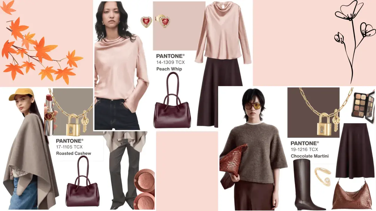
| Neutrals | Camel, warm taupe, mushroom, stone, oatmeal | They keep outfits calm and easy to mix | Trousers, coats, knitwear, base layers |
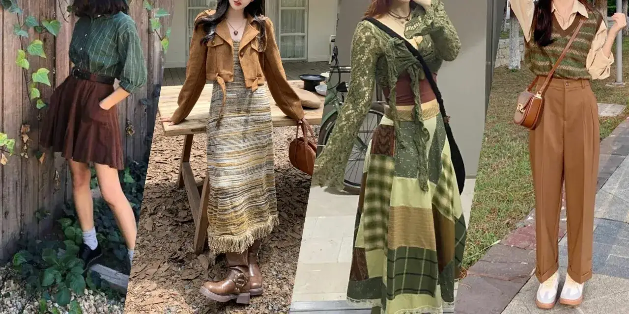
| Greens | Olive, moss, lichen, muted sage | They deliver softness without washing the face out | Shirts, jackets, cardigans |
| Browns | Cocoa, walnut, tobacco, espresso-brown | They replace black with less glare | Shoes, bags, tailoring, outerwear |
| Reds and berries | Terracotta, rust, rosewood, muted cranberry | They add life without pushing into neon territory | Tops, scarves, knitwear, lipstick-adjacent accents |
| Blue-greens | Dusty teal, muted petrol, softened turquoise | They give contrast while staying aligned with the season | Blouses, dresses, statement layers |
| Light shades | Ivory, oat, warm cream, sand | They are gentler than stark white | Tees, shirts, knit bases, scarves |
What matters is not the label on the hanger but the behaviour of the shade. If it looks dusty, mellow and slightly sun-faded, it probably belongs more naturally than something vivid or icy. That is one reason this palette feels so easy to translate into modern British dressing: the broader mood in fashion keeps circling back to wearable colour, just softened enough to live in. Once the colours themselves are clear, the real work is combining them without making the outfit feel flat.
How to build balanced outfits without losing definition
I find that the easiest way to keep this palette modern is to think in layers of depth rather than in one single hero colour. The goal is not to make everything match perfectly; it is to make the outfit feel coherent.
- Use one light neutral, one mid-tone and one deep accent. Oatmeal, olive and espresso is a reliable trio because it keeps the eye moving without creating sharp breaks.
- Stay inside the same softness level. Camel with tan, moss with olive, or rosewood with dusty berry all feel more natural than pairing a soft shade with a loud one.
- Let texture do part of the styling. A dusty teal shirt in brushed cotton looks richer than the same colour in a glossy fabric that catches too much light.
My rule is simple: if I can describe the outfit as softly layered rather than blocky, it is usually on track. Prints can work well too, but they should feel blurred, tonal or gently scaled rather than graphic. Think blurred checks, faded stripes, soft florals and low-contrast abstracts instead of hard-edged patterns.
That formula becomes even more useful when the weather starts doing British things, because fabric and silhouette matter just as much as colour.
The pieces and fabrics that make the palette feel modern in the UK
The UK climate rewards clothes that can handle overcast light, drizzle and a lot of indoor-outdoor moving around. In that setting, soft autumn colours look best when they sit on fabrics with a little body or texture, because matte surfaces echo the muted quality of the palette.
- Outerwear works best in camel, bark, olive or warm grey, especially in trench coats and wool coats.
- Knitwear feels most convincing in ribbed cardigans, brushed cashmere, lambswool and fine merino in oat, moss or rust.
- Trousers and denim should lean toward chocolate, warm taupe, ecru or softly washed indigo rather than harsh black.
- Shoes and bags usually look strongest in tan, warm brown, suede, soft leather and muted olive.
- Jewellery tends to be easiest in brushed gold, antique gold, bronze or rose gold; shiny silver can work, but it is often less forgiving.
This is where the palette feels particularly current. The wider fashion direction in the UK still leaves room for earthy colour, but the strongest looks are the ones that feel wearable in daylight, not just photogenic on a runway. That means a moss cardigan, a tobacco coat or a dusty teal knit can look more relevant than a louder trend piece if the cut is right.
The details are doing a lot of the heavy lifting here, and when they are off, the whole look usually slips. That brings us to the mistakes I see most often.
Where people usually get it wrong
The most common error is treating warm as if it automatically means bright. It does not. A lot of people buy colours that are technically autumnal but still too vivid, too orange or too intense for this softer season.
- Choosing black as a default anchor. It often feels too severe near the face, even when the rest of the outfit is correct.
- Reaching for optic white. It is usually harsher than warm cream or ivory and can make the colouring look tired.
- Using cool greys and blue-based pinks. They can drain warmth and make the palette lose its softness.
- Going too dark too quickly. Deep navy, inky purple and heavy charcoal can overpower the face if they sit too close.
- Assuming every earthy colour works. Bright mustard, hot rust and fiery orange often push the look in the wrong direction.
If I want to test a colour quickly, I hold it near the face in natural light, not under store lighting. The best shades make the skin look clearer and the eyes look softer. The wrong ones create a little tension around the features, even when the colour looks beautiful on the hanger. Once those traps are out of the way, the palette becomes much easier to carry from weekday tailoring to weekend layers.
How to keep the look useful as trends shift
The easiest way to keep this palette feeling fresh is to let trend colour sit inside it rather than replacing it. A muted rose, softened lilac, caramel brown or earthy green can feel very current when the saturation stays controlled and the silhouette is modern.
I would approach it like this: keep the main wardrobe grounded, then let one piece carry a quieter trend note. That could be a sculptural olive bag, a dusty berry knit, a caramel trouser or a softly structured coat in warm grey. The rest of the outfit can stay calm, which prevents the look from becoming costume-like.
- Swap one harsh black item for espresso, dark olive or warm charcoal.
- Add one muted statement colour instead of three competing ones.
- Use texture, not brightness, when you want the outfit to feel richer.
- Choose accessories in tan, bronze or moss when the clothing is especially soft.
If I had to compress the whole approach into one rule, it would be this: keep the colour soft, the silhouette current and the texture intentional. That is what makes the palette flattering, wearable and still relevant as fashion keeps moving.