What matters most before you start choosing colours
- The palette works best when your natural colouring has depth, coolness, and noticeable contrast.
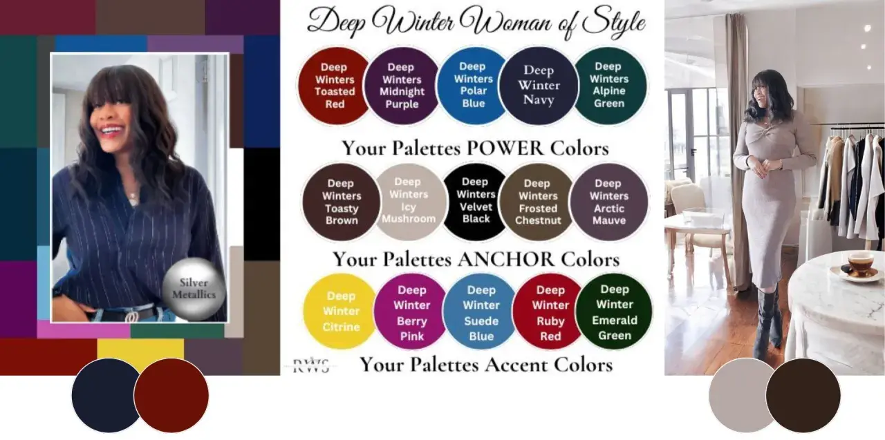
- Core shades include black, ink navy, charcoal, deep berry, emerald, cobalt, and cool teal.
- Muted beige, camel, dusty pastels, and orange-based tones usually weaken the effect.
- Sharp tailoring, clean lines, and rich fabrics help the colours look intentional rather than severe.
- Current fashion leans toward saturated tones and strong neutrals, which makes this palette feel especially relevant in 2026.
What makes this palette feel so sharp
What sets this season apart is not just that the colours are dark. They are dark with clarity. I look for three things at once: depth, meaning the shades sit low on the lightness scale; coolness, meaning they lean blue rather than yellow; and contrast, meaning the palette can handle a clean jump from light to dark without looking muddy.
| Colour dimension | What it means | How it shows up here |
|---|---|---|
| Depth | The colour is visually dark | Think black, navy, pine, wine, and forest green rather than soft mid-tones |
| Temperature | The colour leans cool | Blue-based reds, cool purples, icy pinks, and blue-greens work better than warm shades |
| Chroma | How clear or saturated the colour looks | The best shades are rich, not dusty |
| Contrast | How much light-dark difference the palette can carry | High contrast combinations usually look more natural than blended, low-contrast outfits |
That combination is why the palette can look so elegant on the right person and so flat on the wrong one. If black, ink navy, and jewel tones seem to make your features more defined instead of disappearing into them, you are probably very close to the right season. Next, it helps to get specific about the shades that earn space in the wardrobe.
The shades I would build a wardrobe around
If I were starting from scratch, I would not buy a hundred “winter” pieces. I would choose a small group of reliable colours and let them do most of the work. That keeps the wardrobe coherent, which matters more than having a huge range. For day-to-day dressing, these are the shades that usually give the most return.
| Colour family | Best uses | Why it works |
|---|---|---|
| Black and soft black | Coats, trousers, boots, tailoring | Provides the strongest anchor and keeps contrast high |
| Ink navy | Blazers, denim, knitwear, dresses | Feels less harsh than black while staying equally grounded |
| Charcoal and cool graphite | Knits, wool trousers, outerwear | Adds depth without pulling warm or muddy |
| Deep berry and wine | Lipstick, dresses, evening tops, scarves | Brings colour close to the face without losing intensity |
| Emerald, pine, and deep teal | Statement knits, dresses, accessories | Rich enough to hold their own against dark neutrals |
| Cobalt and sapphire | Shirts, jumpers, satin pieces, bags | Useful when you want energy without warmth |
| Icy pink or blue | Blouses, prints, small accents | Creates controlled brightness instead of a washed-out pastel effect |
The safest neutrals
For most people in this season, the neutrals are where the wardrobe starts to make sense. Black, navy, charcoal, and deep cool grey are the easiest to repeat, and they stop the brighter colours from looking too theatrical. I would use cream only if it is crisp and cool; warm ivory or beige usually works against the face.
The colours to use sparingly
Warm camel, mustard, peach, terracotta, dusty rose, and orange-based reds can quickly dull the effect. That does not mean they are forbidden, only that they tend to work better far from the face, or in very small doses. If a colour seems pretty on the hanger but makes your skin look tired, it is probably fighting the palette rather than supporting it.
Once those core shades are in place, the next question is whether you are actually in the right winter family or slightly closer to a neighbour.
How it differs from true winter and dark autumn
This is the section that saves people from buying the wrong clothes. The deep winter family sits between true winter and dark autumn, which means it can borrow a little from both sides but does not fully belong to either. The practical difference is visible in how much warmth, brightness, and softness a colour can carry before it starts to look off.
| Season | Main feel | Best clue | What usually fails |
|---|---|---|---|
| Deep winter | Dark, cool, rich | Depth matters more than icy brightness | Dusty colours and warm earth tones |
| True winter | Cool, crisp, brighter | Clear contrast and cleaner colour | Softer, smokier shades |
| Dark autumn | Dark, warm, earthy | Muted richness and warmth feel natural | Blue-based or frosty colours can feel disconnected |
If you keep wondering whether a colour is “too bright” or “too warm,” I usually say to check the face first. A good shade should make the eyes look clearer and the skin look more even. If the colour wears you instead of the other way round, it is probably not the right side of winter. That becomes much easier to solve once you know how to build an outfit around the colours you trust.
How to build outfits that look polished rather than heavy
The biggest mistake I see is overloading the look with darkness and then assuming the result should somehow feel elegant on its own. It usually does not. The palette works best when you use contrast, structure, and texture on purpose. A dark coat over a saturated top is more effective than three layers of nearly identical black.
Easy outfit formulas
- Black trousers, cobalt knit, silver jewellery, and a charcoal coat.
- Ink navy blazer, crisp white T-shirt, deep berry skirt, and black loafers.
- Forest green dress, opaque tights, soft black boots, and a structured handbag.
Read Also: Seasonal Colour Analysis - Find Your Perfect Palette
Textures that carry the colour well
Wool, cashmere, brushed cotton, denim, leather, satin, and fine rib knits usually do well because they hold colour with enough body. Overly matte fabrics can flatten rich shades, while flimsy shiny fabrics can make them feel costume-like. I find that one textured piece, such as a wool coat or a satin blouse, often does more for the look than adding another colour.
For everyday wear in the UK, this is where the palette becomes especially practical: dark outerwear, weather-friendly boots, and one concentrated colour near the face can look finished without trying too hard. From there, the same logic carries into make-up and accessories.
Make-up, hair and accessories that keep the look balanced
Make-up is where this palette often becomes obvious. Cool berry lipstick, blue-red lipstick, smoky rose, plum, and deep neutral glosses usually look more coherent than warm coral or orange-based shades. On the eyes, charcoal, cool brown, navy, plum, and soft metallic silver tend to feel cleaner than gold-heavy warmth.
- Lips: blue-red, raspberry, wine, plum, and cool brick shades.
- Blush: cool rose, berry flush, or muted mauve rather than peach.
- Eyes: charcoal, slate, navy, cool taupe, and smoky plum.
- Metals: silver, white gold, gunmetal, and polished platinum.
- Frames and bags: black acetate, dark tortoiseshell with cooler depth, or deep jewel-tone leather.
Hair colour is a softer decision than many guides make it sound. If your natural hair is already dark and cool, a blue-black or cool espresso gloss can reinforce the season. If it has warmth, I would be careful about chasing an inky look just because the palette is dark; sometimes a cooler gloss or a more controlled lowlight is enough. This is one of those places where restraint usually looks better than reinvention.
Accessories matter because they sit closest to the face and can either sharpen the whole outfit or blur it. A silver hoop, a deep green scarf, or a black structured bag can do more for the overall effect than a pile of decorative extras. That same sense of restraint is what makes the palette work with current fashion trends rather than against them.
Where it fits into 2026 fashion trends
In 2026, fashion feels friendlier to saturation than to washed-out minimalism. Rich teal, vibrant violet, inky navy, powder blue, and strong berry tones all sit comfortably beside this palette, especially when they are anchored by black, charcoal, or deep navy. That is useful, because it means the season does not have to be dressed like a uniform to feel current.
| Trend colour | How a deep winter can wear it | Best styling move |
|---|---|---|
| Rich teal | Very naturally | Pair with black tailoring or cool grey denim |
| Vibrant violet | Strongly, in moderation | Use it as a knit, bag, or statement top |
| Powder blue | Only if it stays crisp and clear | Anchor it with dark trousers or a navy coat |
| Candy pink | Possible if it is clean and cool | Keep the rest of the outfit dark and streamlined |
| Canary yellow | Usually harder | Wear it away from the face or skip it entirely |
What I like about this moment in fashion is that the deeper winter wardrobe no longer feels like the quiet option. Strong colour, sharp tailoring, and polished outerwear are all in play, which means the palette can read modern, not just flattering. If you are building a wardrobe in the UK, that gives you room to be expressive without fighting the weather or the trend cycle.
What to remember before you rebuild your wardrobe
If I were building this from scratch, I would keep the system simple: 3 dark neutrals, 3 saturated accents, 2 lighter contrast pieces, and 1 metallic finish. That gives you enough flexibility for work, weekends, and evening wear without losing the clean contrast that makes the palette effective.
- Choose depth first, then worry about fashion trends.
- Keep the colours cool, clear, and rich rather than dusty.
- Use the brightest shades in tops, scarves, or accessories if you are not ready for full-on colour.
- Let at least one element of the outfit carry structure, whether that is a coat, blazer, boot, or bag.
- Trust what happens near the face, because that is where the palette either works or falls apart.
The best result is not a wardrobe that looks extreme; it is one that looks coherent. When the colours, fabrics, and contrasts all work together, the style reads as confident without feeling forced, which is exactly why this palette stays useful well beyond one season.