The fastest route to your season is to test undertone, contrast and chroma together
- Undertone tells you whether warm or cool colours usually flatter you more.
- Contrast tells you whether you suit sharp pairings or softer blends.
- Chroma tells you whether clear brights or muted shades do the heavy lifting.
- Natural daylight matters more than shop lighting or filters.
- If you sit between two seasons, a sub-season is usually the better answer.
What seasonal colour analysis is actually measuring
I start with the three variables that decide most colour-season questions: undertone, contrast and chroma. Undertone is the warm-cool bias in your colouring; contrast is the difference between your skin, hair and eyes; and chroma is the level of clarity or softness in a colour. I also look at value, which simply means whether you read better in light or deep shades. These terms sound technical, but they explain why one person glows in ivory and coral while another looks stronger in black and cobalt.
| Term | What it means | What it changes in clothes |
|---|---|---|
| Undertone | Whether your colouring leans warm, cool or somewhere near neutral | Whether cream, gold and peach feel easier than optic white, silver and icy pink, or the other way round |
| Contrast | The strength of difference between your skin, hair and eyes | Whether you look balanced in crisp contrast or gentler tonal outfits |
| Chroma | How clear, saturated or muted a colour is | Whether bright, clean shades suit you better than dusty, softened ones |
| Value | How light or deep your colouring appears | Whether pale or dark colours sit more naturally against your face |
Seasonal analysis is therefore less about colour names and more about relationships. When a colour and your face seem to belong to the same family, that is usually the clue. Once I separate those variables, the four-season map stops feeling vague and starts feeling useful.
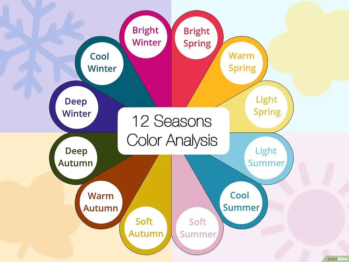
The four main seasons and the signs that point to each one
Once the basics are clear, the classic four-season map becomes useful. I do not treat it as a personality test. I treat it as a quick filter for harmony: does the colour echo your natural colouring, or does it fight it?
| Season | Common visual clues | Colours that often work | Colours that often fight |
|---|---|---|---|
| Spring | Warm, clear, lively and usually medium in contrast | Coral, turquoise, warm pink, apple green, cream | Muddy greys, smoky browns, icy pastels |
| Summer | Cool, soft, lower contrast and often gently blended | Powder blue, dusty rose, lavender, rose beige, soft navy | Harsh black and white, neon brights, very earthy tones |
| Autumn | Warm, muted, rich and often deeper in feel | Olive, rust, moss, camel, chocolate, burnt orange | Icy blues, stark white, hard jewel tones without warmth |
| Winter | Cool, clear, high contrast and visually sharp | Cobalt, black, true red, emerald, icy pink, silver | Dusty neutrals, softened earth tones, washed-out pastels |
If you look better in peach, warm cream, turquoise, coral or apple green, Spring is worth exploring. If powder blue, rose beige, soft navy and lavender make you look rested, Summer is the likely lane. If olive, rust, camel, moss and chocolate seem to settle your features, Autumn is probably close. If black, optic white, cobalt, emerald, icy pink or true red give you instant definition, you are likely in Winter territory.
The mistake I see most often is people judging colour by liking it on a hanger. A colour can be fashionable and still be wrong on your face. That is exactly why the next layer matters when the first answer feels too neat.
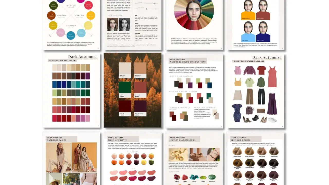
Why sub-seasons matter when the answer is not obvious
Very few people are a perfect poster child for a single season. This is where the 12-season model helps: it splits each family into lighter, softer, clearer or deeper variations. In practice, that means the dominant trait matters more than the season label itself. If muted colours calm your appearance but warm shades also help, Soft Autumn may fit better than plain Autumn. If you can wear bright colour but only when it is icy or crisp, you are probably looking at Cool Winter or Clear Winter rather than the broad Winter bucket.
- Light types usually look best in airy colours with less visual weight.
- Soft types usually need dusty, blended shades rather than clean brights.
- Clear types usually come alive in crisp, saturated colour.
- Deep types usually handle richer, darker colours more easily than pale ones.
This is why two people can both be “Summer” and still need very different wardrobes. One may need lighter and more delicate shades, while another needs cooler but slightly deeper tones. The sub-season layer turns colour analysis from a blunt label into something you can actually shop with. The next step is testing those clues in a way that does not lie to you.
How I test a season at home without fooling myself
When I test colour at home, I keep the setup boring on purpose. I remove makeup, pull hair back, stand near a window in neutral daylight and compare colours against a plain top or drape. Warm bulbs, ring lights and phone filters all flatten the result, so they are the first thing I ignore.
- Compare gold and silver near your face. Gold usually lifts warm colouring; silver usually sharpens cool colouring.
- Test one clear colour against one muted colour. If clear shades win, your palette may be brighter than you thought.
- Check a light shade and a deep shade. The better match often echoes your natural value.
- Take a photo, then look at whether your eyes stand out, your skin looks even and shadows soften or harden.
- Repeat with a second day and a second light source. One test is a clue; two consistent tests are a pattern.
I would not build a wardrobe on a single mirror session, especially if your hair is dyed or your skin tone changes with the season. The point is consistency, not perfection. When the test is honest, your shopping list gets much shorter, and that leads neatly into how trends fit into the picture.
How to wear your season with 2026 fashion trends in the UK
2026 colour trends are not the enemy of seasonal analysis. They just need translation. The runways are leaning into vivid brights, softened pastels and strong contrast, which means nearly every palette can borrow something if you choose the right version. In the UK, where weather and layering matter, I care less about headline colours and more about whether they work in coats, knitwear, scarves and shirts you actually reach for.
Here is the rule I use: let your season choose the saturation, then let the trend choose the mood. A Winter can wear chartreuse if it is sharp enough; an Autumn can wear bright colour if it leans olive or terracotta; a Summer can take part in the pastel trend without going icy white; a Spring can use butter yellow or coral without washing out.
- Cobalt, cherry red and optic white are easy wins for clearer, higher-contrast seasons, but they can still work for others when softened by texture or worn away from the face.
- Butter yellow and blush pink are trend-safe in 2026, but the exact tone matters: warmer versions help Spring and Autumn, cooler versions help Summer and Winter.
- Chartreuse and lime lean vivid, so they often suit Clear types best; muted palettes usually do better with olive, moss or pistachio instead.
- Champagne beige and soft stone are useful neutral trends, especially if your palette needs a quieter base rather than a stark contrast.
For a UK wardrobe, I would apply trend colours first to knitwear, scarves, bags and shirts rather than jumping straight to full outfits. That keeps the experiment low-risk and makes it easier to tell whether the trend is genuinely flattering or just momentarily exciting. From there, it becomes much easier to read your result in real life.
The most useful way to read your result in real life
Your season should make dressing easier, not smaller. I use it as a permission structure: fewer random purchases, better basics and more confidence when a trend appears everywhere but does nothing for me. That is especially useful if you are defining a more authentic style expression, because colour can support presence without forcing you into a look that does not feel like you.
If you are still undecided, do not force a label. Start with the colours that make your skin look calm, then note whether they are warm or cool, clear or soft, light or deep. The answer usually shows up faster than people expect, and once it does, shopping feels less like guessing and more like editing.
That is the practical value of colour season work: it gives you a repeatable filter for clothes, makeup and trend pieces, so the wardrobe you build in 2026 looks intentional rather than accidental.