
Warm-weather dressing gets easier when colour does some of the heavy lifting. A summer color palette works best when it feels like a styling tool, not a mood board, so I’m looking at the shades, combinations and fabrics that actually hold up in the UK. I’ll focus on the colours that feel current in 2026, the pairings that stay wearable beyond one sunny weekend, and the small rules that keep bright clothes from looking forced.
Key points at a glance
- Summer 2026 leans into a mix of soft pastels, clear brights and cleaner neutrals rather than one fixed look.
- Butter yellow, turquoise, tomato red, burnt orange and cloud-white are the easiest trend shades to wear well.
- Fabric choice matters as much as colour. Linen, poplin, crochet and light satin make the palette feel more modern.
- In the UK, layering is non-negotiable, so every colour choice should work with a jacket, cardigan or overshirt.
- The most wearable outfits usually use one anchor neutral, one main colour and one accent.
What a summer colour story looks like in 2026
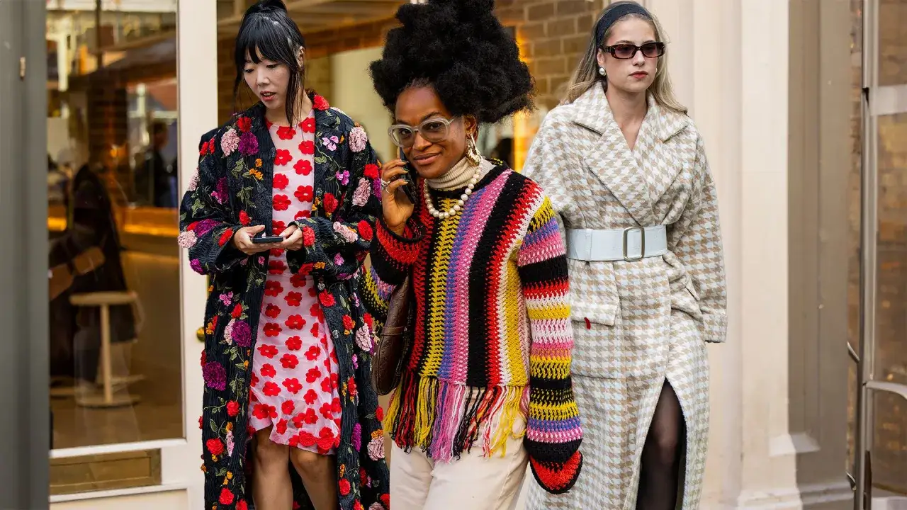
The strongest direction I’m seeing is contrast with restraint. British runway coverage keeps returning to a blend of softened pastels, sun-warmed brights and airy neutrals, which makes sense: the palette needs to feel fresh in daylight, but still look polished when the weather turns. Instead of a single “it” shade, the season is giving us several useful lanes - sea-glass blues, pale butter tones, tomato red, burnt orange, lilac and clean white.
For me, the real shift is that summer colour is less about being loud and more about looking awake. A blue shirt, a yellow knit vest or a red slip skirt can all work, but only if the rest of the outfit gives the colour some structure. That is why I treat colour as part of the silhouette, not an afterthought.
The next step is deciding which shade family deserves space in your wardrobe, because not every trend colour earns the same amount of use.
The shades I would actually build around
If I were editing a wardrobe from scratch, I would not buy every popular shade. I would pick a small set that covers different jobs: one soft neutral, one fresh blue, one warm accent and one expressive colour for evenings or events. The table below shows how the current season breaks down in practice.
| Shade family | What it feels like | Best pieces | Why it works |
|---|---|---|---|
| Cloud white and stone | Light, clean, easy | Shirts, tailored trousers, tank tops, summer blazers | These neutrals calm the brighter shades and make layering look deliberate. |
| Butter yellow and pale banana | Soft, optimistic, flattering in daylight | Knits, dresses, poplin shirts, handbags | They read sunny without becoming aggressive, which makes them easier to wear than neon yellow. |
| Turquoise and sky blue | Fresh, cool, coastal | Shirts, draped tops, swimwear, sheer skirts | Blue-green tones feel especially useful for British summers because they look crisp even on humid or grey days. |
| Tomato red and mandarin orange | Confident, graphic, lively | Slip dresses, shorts, sandals, statement bags | These shades bring energy fast, so one item is often enough to change the whole outfit. |
| Burnt orange and caramel | Sun-baked, grounded, slightly retro | Linen sets, midi skirts, trousers, utility shirts | Warmer tones feel less obvious than bright citrus and pair well with denim, cream and olive. |
| Burnished lilac and teaberry pink | Expressive, playful, a little romantic | Event dressing, shirts, accessories, occasion pieces | These shades add personality without needing a full rainbow approach, which is useful for Pride season and other high-energy summer events. |
I like this kind of palette because it gives you range without chaos. You can stay understated in the day and still move into a more expressive look at night without changing your entire wardrobe.
Once the colour families are clear, the main challenge becomes making them look intentional rather than over-styled.
How to wear brighter tones without losing polish
My rule is simple: let one colour lead, then make everything else support it. That usually means keeping most of the outfit in denim, ivory, charcoal or sand, and giving the bold shade one clear job. A tomato red skirt with a white shirt feels sharper than a red top, red bag and red shoe all fighting for attention.
Anchor the look with a neutral
Neutral pieces are not a cop-out; they are the structure. If at least half the outfit is quiet, even a very saturated shade starts to look expensive rather than chaotic.
Match the fabric to the colour
Bright colour looks better in linen, cotton poplin, crochet or brushed jersey than in stiff synthetic fabrics. Texture diffuses the pigment, which is why a butter-yellow linen dress usually feels more convincing than the same shade in shiny polyester.
Read Also: Soft Autumn Palette - Your Guide to Effortless Style
Repeat the shade once
I rarely repeat a colour more than twice in one look. If I wear turquoise at the top, I might echo it with a small accessory or a patterned detail, but I stop there. That small repetition makes the outfit feel intentional without becoming theatrical.
These rules matter most when you are dressing for real life, because the same palette has to work for office days, weekends and all the in-between moments.
The combinations that feel most wearable in the UK
British summer dressing has one practical problem that fashion glosses over: the weather can swing in a single afternoon. I build palettes with that in mind, which means every combination should survive a light jacket, a change of shoes and a sudden drop in temperature. The pairings below are the ones I think earn their place.
| Occasion | Colour pairing | Why it works | Easy styling note |
|---|---|---|---|
| Office day | Cloud white, sky blue, navy | It feels polished but not heavy, and the blue keeps the look seasonal. | Add a lightweight blazer and loafers for a sharper finish. |
| Weekend in the city | Burnt orange, denim, stone | The mix feels relaxed, modern and easy to repeat. | Use one textured piece, such as a linen shirt or canvas bag, to stop it looking flat. |
| Wedding guest | Butter yellow, ivory, silver | Soft colour reads celebratory without competing with the event itself. | Keep the silhouette clean so the palette does the work. |
| Pride season or a night out | Teaberry pink, mandarin orange, white | It has energy, visibility and a strong camera-friendly contrast. | Limit accessories so the palette stays bright rather than cluttered. |
| Seaside or holiday break | Turquoise, tan, clean white | It is classic for a reason: the colours feel fresh against sunlight and skin. | Choose fluid fabrics so the shade reads breezy, not costume-like. |
If I want a look to feel especially current, I mix one trend shade with one familiar basic rather than stacking several trend colours together. That balance is what keeps a seasonal palette from looking dated by the end of July.
The only remaining issue is avoiding the small mistakes that make even good colours behave badly.
Common mistakes that make warm-weather colours look cheaper
The biggest mistake is assuming the colour itself is the problem when the real issue is proportion. A loud shade with thin fabric, poor fit and no neutral break will look harsh; the same shade in a better cut can feel polished immediately.
- Too many saturated colours at once. If every piece is shouting, nothing feels intentional.
- Ignoring fabric quality. Cheap synthetics can make even beautiful colours look flat or shiny in the wrong way.
- Skipping a neutral anchor. A bright palette needs breathing space, especially in daylight.
- Buying a colour that does not connect to your wardrobe. A gorgeous shade is still wasted if it can only be worn with one item.
- Forcing a trend that does not fit your life. If you work in a conservative office, a full red set may be too much, but a red accessory can still be useful.
I also think people overestimate how much colour needs to be “perfect” against the body. What matters more is whether the combination makes sense with your style, your contrast level and the way you actually move through the day. When the outfit feels natural, the colour usually follows.
That is why I prefer a capsule-style approach for the final edit.
A capsule edit that will keep the palette useful all season
If I were keeping this practical, I would build the season around five pieces of colour logic rather than a pile of separate trend buys: one light neutral, one blue family, one warm accent, one expressive shade and one texture-driven piece. That might look like a cloud-white shirt, a sky-blue dress, butter-yellow knitwear, a burnt-orange bag and a lilac accessory, but the exact items matter less than the balance between them.
- Start with one neutral base that works with everything else.
- Add one cool shade for days when you want the outfit to feel fresh.
- Keep one warm accent for instant energy.
- Choose one expressive colour for events, photos or nights out.
- Use texture to make the palette feel richer than plain colour blocking.
The best summer color palette is the one that still works when the weather cools, the plans change and you need the same clothes to do a second job. If you keep the range tight, choose fabrics well and give each shade a clear role, the season starts to feel easier to dress for, not harder.